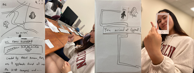
Felt like a generally straightforward process. Main critique was to consider what the we wanted the user to do most, use the routing feature to go to site location or view gallery images. If it was to go to the location, then make the routing button bigger and clearer and vice versa. Enjoyed the idea of a reward system with the icons.